
问题描述
对于我正在管理的网站,我正在使用新的 safe-area-inset-<position> 处理 iPhone X 系列屏幕安全区域,这在 Safari 浏览器上运行良好你可以在这里看到:
For the website that I am managing, I am handling the iPhone X family screen safe area using the new safe-area-inset-<position> and this is working fine on Safari browser as you can see here:
使用以下代码:
/* white container for the home bar that has an height only on devices that read the safe area to cover the transparency around that bar */
.ctc-container {
    background: $white;
    display: block;
    position: fixed;
    left: 0;
    right: 0;
    bottom: 0;
    width: 100%;
    min-height: env(safe-area-inset-bottom);
    z-index: 100;
}

/* chat and phone number container are positioned at the bottom of the safe area (for devices that read it) or at the bottom of the page */
.ctc-box {
    position: absolute;
    bottom: 0;
    bottom: env(safe-area-inset-bottom);
}
现在问题出在 Chrome 浏览器上,因为它显然还没有处理安全区域,所以聊天和电话号码框与 iPhone 主页栏重叠.
Now the problem is on Chrome browser because apparently it is not handling the safe area yet, so the chat and phone number box is overlapped by the iPhone home bar.
是否有任何 CSS 解决方案可以应用于 iPhone X 系列设备上的 Chrome 来处理安全区域?
Is there any CSS solution that can be applied for Chrome on iPhone X family devices to handle the safe area?
推荐答案
您是否已将 viewport-fit=cover 添加到您的 meta[name="viewport"] 中?
Have you added viewport-fit=cover to your meta[name="viewport"]?
这篇关于在 iPhone X 系列上处理 Chrome 浏览器中的安全区域的文章就介绍到这了,希望我们推荐的答案对大家有所帮助,也希望大家多多支持跟版网!

 大气响应式网络建站服务公司织梦模板
 高端大气html5设计公司网站源码
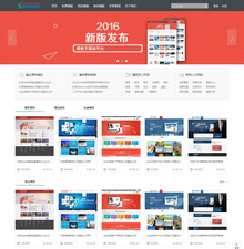 织梦dede网页模板下载素材销售下载站平台(带会员中心带筛选)
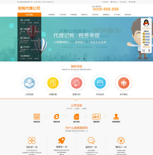 财税代理公司注册代理记账网站织梦模板(带手机端)
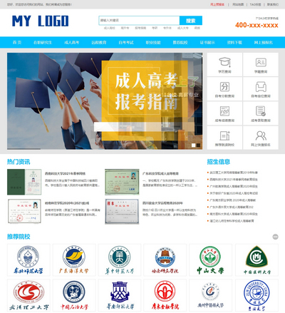 成人高考自考在职研究生教育机构网站源码(带手机端)
 高端HTML5响应式企业集团通用类网站织梦模板(自适应手机端)