
问题描述
我无法让 Semantic UI React 网格完全响应,至少以我想要的方式响应桌面、平板电脑和移动设备.
I'm having trouble making Semantic UI React grid fully responsive, at least respond the way I want for Desktop, Tablet and Mobile.
我在网格列中呈现以下三个组件.
I have following three components which I am rendering in Grid Columns.
import React,{ Component } from 'react';
import { connect } from 'react-redux';
import { Grid, Header } from 'semantic-ui-react'
import GetJobs from '../../components/Home/GetJobs';
import PostForm from '../../components/Home/PostForm';
import Feed from '../../components/Home/Feed';
import Articles from '../../components/Home/Articles';
import './home.css'

class Home extends Component {
  render() {
    return(
      <Grid id="home" stackable columns={3}>
        <Grid.Row>
          <Grid.Column>
            <Header>Articles</Header>
            <Articles/>
          </Grid.Column>
          <Grid.Column>
            <Feed/>
          </Grid.Column>
          <Grid.Column>
            <Header>Jobs</Header>
            <GetJobs/>
          </Grid.Column>
        </Grid.Row>
      </Grid>
    )
  }
}

export default Home;
从桌面设备转移到移动设备时,列可以正确堆叠.它从 3 列变为 1 列.但是,对于平板电脑大小,3 列只是更紧密地安装,而不是在屏幕上有 2 列,1 列堆叠在下方.
The columns stack properly when going from desktop to mobile. It goes from 3 to 1 column. However, at tablet size, the 3 columns are just fitted more tightly instead of having 2 columns on the screen, and 1 being stacked below.
查看组件组件的平板视图
理想情况下,我希望在从台式机切换到平板电脑大小以及从平板电脑切换到移动设备时,Feed 和 Jobs 留在屏幕上,Feed 位于顶部,Jobs 位于下方,Articles 位于底部.
Ideally, I'd like Feed and Jobs to stay on the the screen when going from Desktop to Tablet size, and when going from Tablet to Mobile, have Feed on top, Jobs below, and Articles at the bottom.
对于如何让这个网格做出这样的响应,我们不胜感激.
Any help is appreciated on how to get this grid to respond like this.
推荐答案
stackable prop 仅在移动设备上折叠列,为了精确控制不同设备上的宽度,您应该使用 响应 道具.您也可以尝试使用 only 和 反向.我做了一个例子来说明如何做到这一点.
stackable prop collapses columns only on mobile device, for precise control of widths on diffent devices you should use responsive props. You can also try to play with only and reversed. I made an example that shows how to do this.
<Grid>
  <Grid.Column only='computer' computer={5}>
    <Header>Articles</Header>
  </Grid.Column>
  <Grid.Column mobile={16} tablet={8} computer={5}>
    <Feed/>
  </Grid.Column>
  <Grid.Column mobile={16} tablet={8} computer={5}>
    <GetJobs/>
  </Grid.Column>
  <Grid.Column only='mobile tablet' mobile={16} tablet={16}>
    <Header>Articles</Header>
  </Grid.Column>
</Grid>
这篇关于响应式语义 UI React 网格、列、行的文章就介绍到这了,希望我们推荐的答案对大家有所帮助,也希望大家多多支持跟版网!
 on a no")

 大气响应式网络建站服务公司织梦模板
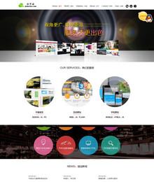 高端大气html5设计公司网站源码
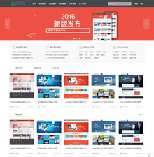 织梦dede网页模板下载素材销售下载站平台(带会员中心带筛选)
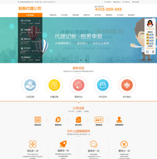 财税代理公司注册代理记账网站织梦模板(带手机端)
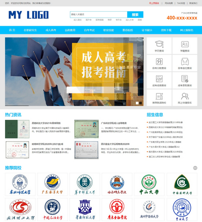 成人高考自考在职研究生教育机构网站源码(带手机端)
 高端HTML5响应式企业集团通用类网站织梦模板(自适应手机端)